This post builds on the interest previously shown on the topic and goes further to break down our household income and our spending, including giving.
Getting Clear on Giving
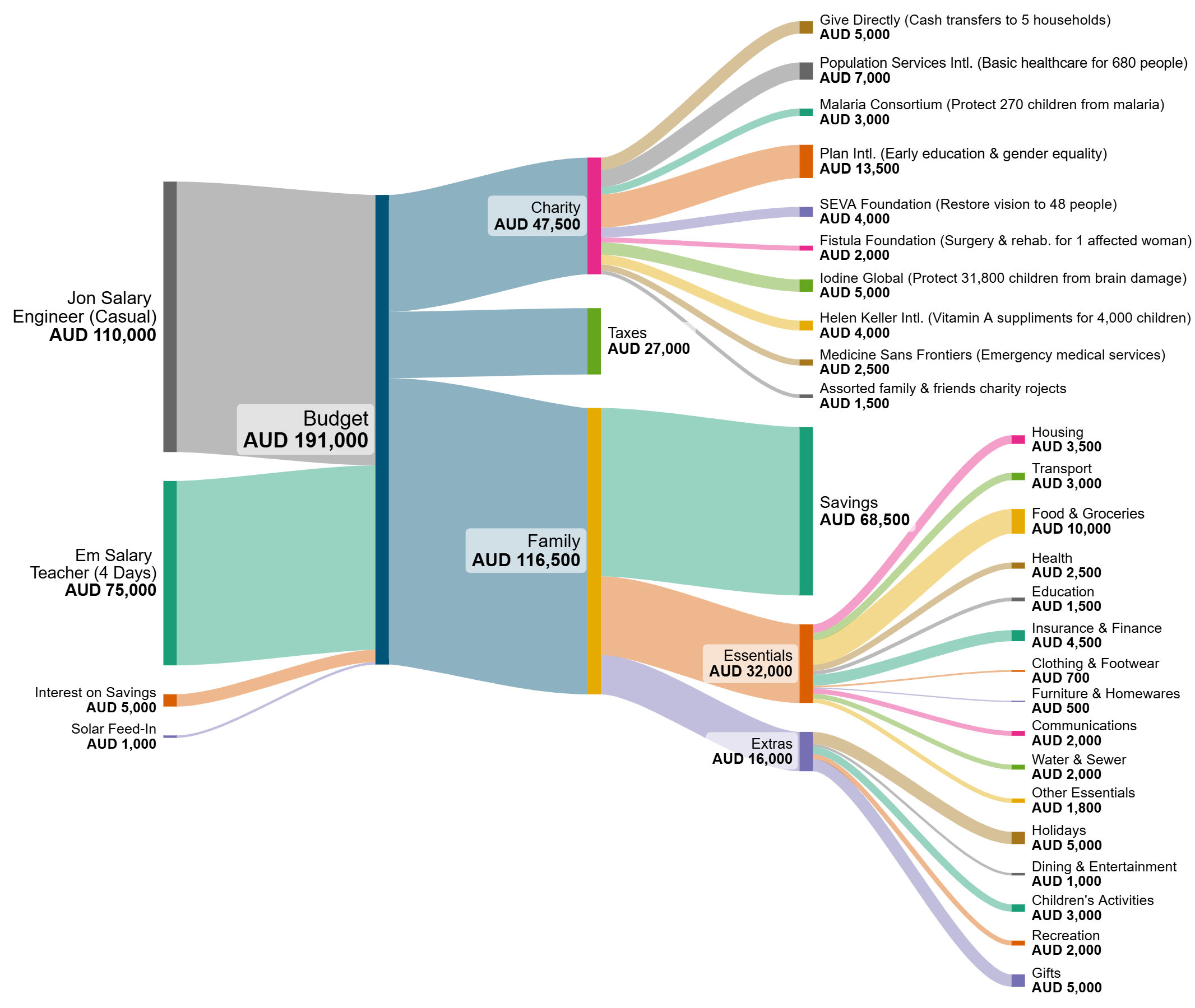
Each year, we reflect as a family on what we value most. In 2024, that meant digging deep, not just into our wallets, but into what matters. For us, that’s global justice – improving fairness across the whole population. And it’s why we gave around 25% of our income, roughly $47,000, to effective charities this year. I posted about this previously with The Power of Giving where we used soybeans to represent money.
To make this a little clearer and combine it with the popular post How We Afford to Give, I’ve created a Sankey diagram that shows not just where the money came from and where it went, but what it did and who it helped. The figures are slightly different to previously shared as we now have a more complete picture of our spending and saving than we did when doing this on the “back of and envelope” before Christmas last year.
In the video below Emelie, Adam, Dani and I discuss how we arrived at the choice of which organisations to support, in particular the role of The Life You Can Save‘s very cool Impact Calculator which lets you see just how your donation might change lives.
Where the Money Went and What It Did
Using research from The Life You Can Save and the best available cost-effectiveness data, we decided to split our giving across several high-impact interventions:
- Basic healthcare and family planning for 680 people, giving control over their future (PSI).*
- Two years of basic income for five families, breaking the poverty cycle (GiveDirectly).*
- Anti-malaria treatments for 270 children, saving lives (Malaria Consortium).*
- Clean water access for 1,000+ people, reducing disease and freeing girls to attend school (Plan International).
- Cataract surgeries for 48 people, restoring sight and livelihoods (Seva).*
- Fistula repair for one young woman, giving her life back (Fistula Foundation).*
- Iodine for about 32,000 people, preventing developmental delays (IGN).*
- Vitamin A for 2,000 people, avoiding blindness (Helen Keller Intl).*
- Emergency medical care through Médecins Sans Frontières.
These numbers are more than statistics. They represent real lives changed. People no longer burdened by blindness or poverty, children now able to grow up healthy, women returning to their communities with dignity.
* In the end we decided to combine these amounts and give instead to the Maximum Impact Fund to ensure our donation could have the greatest possible impact, rather than the ones that felt best to us.
Giving as a Family
This wasn’t just our decision, it was a conversation. In the video, you’ll hear why each of us gives to the organisations we do. By making giving part of our family culture, we’ve created space for our kids to engage with the world thoughtfully and compassionately.
Why We Give So Much
Because we can. And because, as Peter Singer puts it, if you’d save a child from drowning even if it cost your shoes, why not save a child from malaria even if it costs a Netflix subscription or takeway coffee?
And because giving works. Just look at the data on falling child mortality. Progress is real, but it depends on continued support.
We still live comfortably. We still save for the future. We still have hobbies, take family holidays (by train and bike and hitch hike!), and enjoy life. But we’ve chosen to live more deliberately, consume less, and find joy in what matters, not what’s marketed to us.
Join Us
We’re not asking everyone to give 25%. But we are inviting you to consider what’s possible. If the wealthiest 10% gave just 1%, it would double the income of the poorest billion people, radically transforming global health, education, and resilience while also finding a greater sense of purpose. If you are reading this you are probably in the wealthiest 10%. Check out How Rich am I? if you don’t believe me.
So if this resonates, take a moment to explore The Life You Can Save, make a pledge at Giving What We Can, or talk to us in the comments or via the Contact page. We’re happy to share what we’ve learned and hear your story too.
Together, we can make a meaningful difference.
3 thoughts on “From Soybeans to Sankeys – Visualising Spending and Impacts”